How to Create Graphics With AI That Actually Grow Your Audience
(And convert your audience into leads and sales)
Today I've got a meaty one for you.
By the time you're done reading this, you're going to have two things...
First, a clear understanding of why your AI graphics look inconsistent (and what to do about it).
Second, the exact prompt I built that walks you through creating your complete visual brand guide... step by step... so every graphic you produce from that point forward looks unmistakably like YOUR brand.
I'm giving it away for free at the end of this issue. But read the whole thing first. The context matters.
Not "kinda like you."
Not "close enough."
Actually you.
Because right now... most people's visual brand looks like it was assembled by five different interns, three Canva templates, and a confused robot.
You know exactly what I'm talking about.
Everything vaguely matches. Nothing actually does.
One post has a bold serif headline. The next uses bubbly rounded sans-serif. The background is navy blue... then off-white... then a stock photo of someone pointing at a whiteboard.
(Nobody knows why. Including the person who posted it.)
AI didn't create this problem.
AI just made it faster.
Before AI, you'd produce 3-4 inconsistent graphics a week. Now you can produce 30. And every single one looks like it came from a slightly different brand.
That's not a workflow problem. That's a system problem.
And if you're using AI for graphics without fixing it first... you're just moving faster in the wrong direction.
Graphics Have a Job. Most of Yours Are Unemployed.
Most people think graphics are just decoration. Something to make content look nicer.
Wrong.
Graphics do jobs.
Stop the scroll. Create pattern recognition. Build the visual shorthand that makes someone know your content is YOURS before they even read the caption.
That's the job. That's all of it.
And when graphics don't do that job... they're not just useless. They're actively working against you.
Every inconsistent post trains your audience (slowly, unconsciously) that your brand is scattered. That there's no clear identity behind the content. That it's hard to remember where they saw something good.
People don't consciously notice this. They just don't follow. Don't share. Don't remember.
Here's what it looks like when your graphics actually do their job...
See how those all feel like the same person?
Same color palette. Same typography direction. Same emotional tone. Same visual DNA.
That didn't happen by accident. And it didn't happen by opening Canva and winging it.
It happened because there's a system underneath all of it.
The Slot Machine vs. The Specialist
Here's what actually happens when most people use AI for graphics.
They open a tool and start generating.
No system. No rules. No defined aesthetic. Just vibes and prompts and hoping something lands.
And the output is random.
Random colors. Random typography. Random image treatment. Random emotional tone from post to post.
Some look polished. Some look cheap. None of them look like each other.
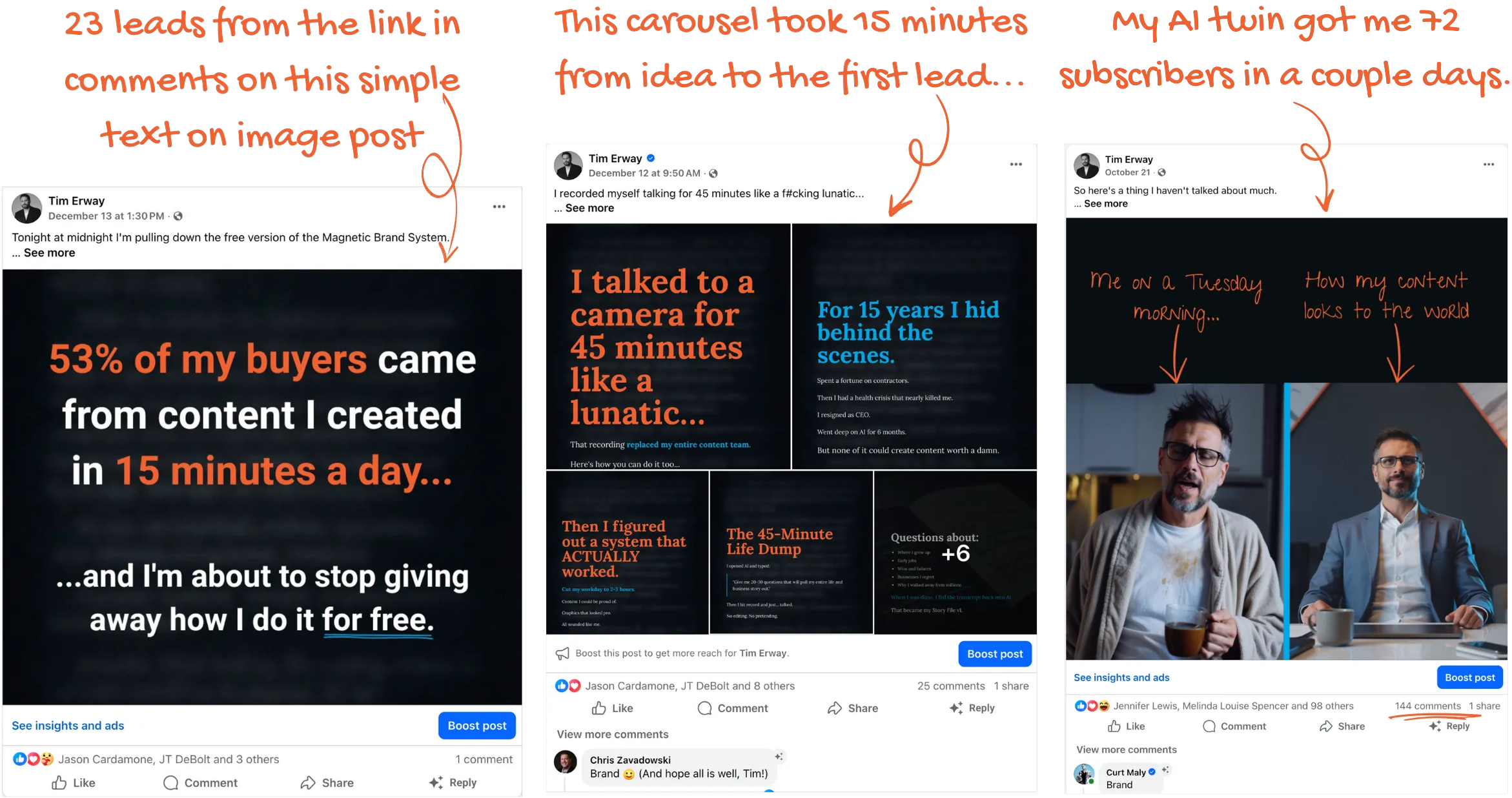
I talked about this last week when I walked you through how my AI agent content factory works. The drunk-11-year-old-with-a-500-IQ thing.
Same principle applies here.
Give a generalist AI a vague request with no structure... you get the drunk. Give it a clear system, specific context, and guardrails... you get the genius.
Most people are treating AI image generators like a slot machine. Pull the lever, see what comes out, keep what looks good. Every session is a fresh spin with no memory of the brand.
Slot machines pay out occasionally.
That's not a content strategy.
A trained specialist is completely different. It has rules. It has taste constraints. It has a defined system to work within. And it produces outputs that are coherent because it knows what coherent looks like for YOUR brand.
"Pretty Good" Isn't Good Enough
You might be reading this thinking your graphics aren't that bad. Some of them look pretty good.
Maybe.
But "pretty good" isn't the threshold that matters.
Here's the threshold... can your audience recognize it's you before they read your name?
If the answer is anything less than a hard yes... you've got a recognition problem.
And recognition is not a vanity metric. It's a growth metric.
When your visuals are inconsistent, your audience doesn't build a clean mental association with your brand. They can't easily call you to mind. They don't immediately know where to file you in their mental rolodex.
That lowers engagement. Lowers shares. Lowers trust. And over time... lowers conversion.
The businesses that dominate their space aren't necessarily the ones with the best product or the most content. They're the ones people can see from across a crowded feed.
Strong visual brands have what I'd call compound equity. Every post that looks consistently like YOU adds a tiny deposit to a recognition account that pays dividends forever.
Weak visual brands spend that same time creating content that disappears.
Fix the System First. Then Generate.
Here's the part nobody wants to hear because it requires doing something before creating more sh!t.
You need to define the visual brand before you generate another graphic.
Not in a complicated, hire-a-designer, spend-$20k kind of way.
In a practical, write-it-down, give-AI-something-to-work-with kind of way.
This means getting clear on a few things...
The emotional tone of the brand. How should people feel when they see your content? Energized? Calm? Provoked? Aspirational?
The audience and what they respond to. Not demographics. Psychographics. What does this person actually care about, fear, and want?
Visual aesthetic keywords. Three to five words that capture the feeling. Confident. Clean. Bold. Slightly raw. Human. Whatever fits.
Color direction. Not a specific hex code (yet). A direction. Warm or cool. Saturated or muted. Dark or light.
Typography direction. Serif or sans. Heavy or light. Classic or modern.
Imagery rules. Photography or illustration. People or concepts. Lifestyle or editorial. What you'd never use.
Design do's and don'ts. What you've seen and loved. What you've seen and hated.
Overall brand feel. If your brand were a restaurant, what would it be? If it were a person, how would they dress?
Once you have this... you have a brief.
Not a design brief. A brand brief. The source document that tells AI what to optimize for instead of letting it guess.
(Spoiler... it's always guessing right now. This is how you stop that.)
Here's what mine looks like...
That single document is the reason every graphic I produce looks like it belongs to the same brand. Without it, I'd be right back on the slot machine.
Now... building a brand brief sounds like work.
And it is... once.
So I built a prompt that makes it way faster.
It's a guided interview. You paste it into your AI of choice and it asks you the right questions, one at a time. It coaches you through the parts where people get stuck (like choosing colors). It pushes back when your answers are too vague. And it compiles everything into a finished Brand Discovery + Visual Guide that you can use with any AI to create on-brand graphics.
Not a generic form. Not a list of pre-set aesthetics.
A real conversation that pulls the inputs specific to YOUR brand, YOUR audience, and the feeling YOU want to evoke.
One hour. Done. Everything downstream gets better immediately.
Do this first. Before you generate another graphic. Before you open Canva. Before you fight with another template.
This is the foundation.
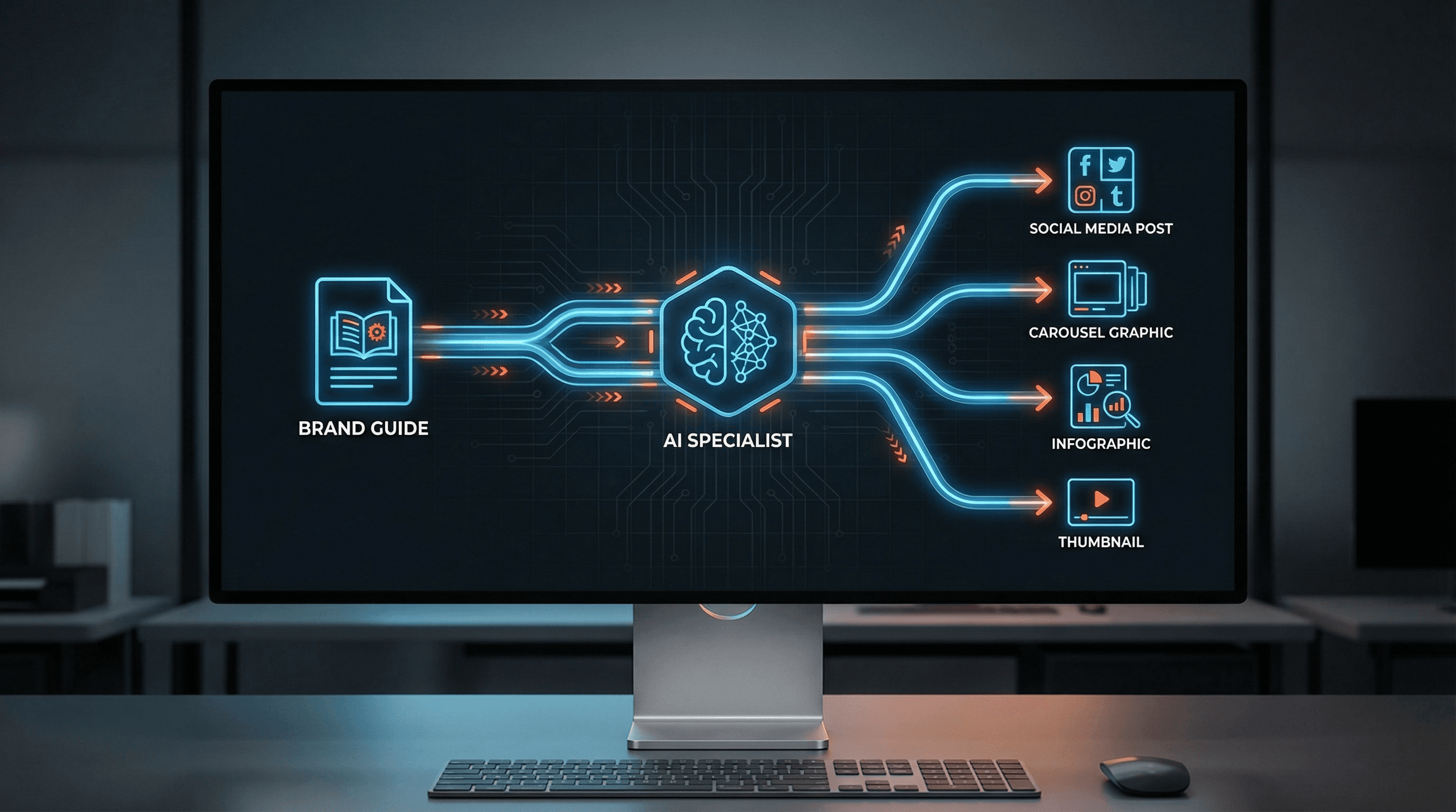
How AI Gets Better Once the System Exists
Here's what changes once you have the guide.
You upload it into a dedicated project to create a true AI specialist.
Now, a quick but critical distinction here.
Last week, I talked about how I use my trained AI agents in OpenClaw and Paperclip to create first drafts and generate images. That's my advanced setup. But for most people? It's over the top and way too complex.
That's why I recommend Manus as the best entry point.
It works beautifully out of the box, creates great content, and generates on-brand visuals using its built-in image generation. (In fact, the featured image at the top of this newsletter was generated by my Creative Director project right inside Manus.)
If Manus isn't an option for you, ChatGPT is your next best bet. Gemini is fine for brainstorming, but it doesn't have the ability to create true AI specialists (it just has "Gems," which aren't the same thing).
Both Manus and ChatGPT allow you to create true AI specialists using a "Project" where you can store your brand guide as a foundational document. Every time you come back and create a new chat or task, you get consistent output because the specialist remembers the rules.
Now the model has context.
It knows your colors. Your typography direction. Your emotional tone. What to avoid. What to aim for.
Now it can operate like a specialist instead of a general assistant.
This is the exact same principle I talked about last week... a specialist without training documents is just a generalist with a job title. And a generalist with a job title is still going to give you the same lukewarm, sounds-like-everyone-else output.
But here's the most important part about building this system.
You are creating an evergreen asset.
The platform doesn't matter as much as you think. Build the training documents once. Use those same documents in Manus, in ChatGPT, or even do what I'm doing and build custom AI employees down the road.
The assets transfer. The platform is just where they happen to live right now.
Here's What This Actually Unlocks
Once the system exists, here's what you can produce with AI...
Social graphics. Carousels. Quote graphics. Lead magnet covers. Thumbnails. Infographics. Even slide presentations.
All faster. All with more visual consistency than you've ever had before. All without the chaos of every post feeling like a different brand.
All images come from the same system. Same brand guide. Same AI specialist. Different formats... same visual DNA.
Here's the more important point though.
This is not about making more content.
It's about making content that compounds.
Every graphic that looks unmistakably like YOUR brand adds to the recognition account. Every post that looks scattered withdraws from it.
Build the system once. Then let AI scale it.
That's the leverage.
The Bigger Picture
Visual consistency is half the equation.
The other half is voice, messaging, and positioning.
The prompt I gave you above handles the visual side. That alone will put you ahead of 90% of people using AI for graphics.
But when your graphics look like you AND your copy sounds like you AND your positioning is sharp... your brand stops being forgettable. It becomes magnetic.
That's not an accident. That's a system.
And the Magnetic Brand System is exactly that. The full build. Visual brand. Voice brand. Strategic positioning. AI specialists trained on YOUR brand DNA so every piece of content... written and visual... comes out sounding and looking like you.
Not a template. Not a fill-in-the-blank prompt pack.
The actual foundation your AI needs to represent you without sounding like a robot wearing your name tag.
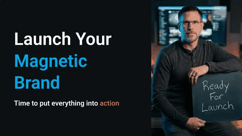
Get the Magnetic Brand System
The One Thing I'd Want You to Take Away
AI is not the advantage here.
Clarity is.
Clarity about who you are. What you look like. What you sound like. What you stand for.
AI just scales whatever clarity (or confusion) you give it.
Most people are scaling confusion. Random graphics, random voice, random content... moving fast with nothing underneath it.
The people who build the foundation first... who get clear before they get productive... they're the ones whose brands compound over time.
Build the system.
Then let AI work it.
Until next time,
—Tim Erway

P.S. If you skimmed to the bottom (I see you)... here's the short version. I built a free prompt that walks you through creating your complete visual brand guide in about an hour. It's the single biggest thing you can do to make your AI graphics stop looking like they came from five different brands. Grab the Brand Discovery + Visual Guide Prompt here. And if you want the full system... voice, visuals, positioning, AI specialists trained on your brand DNA... that's the Magnetic Brand System.
P.P.S. If you missed last week's deep dive on building your AI agent content factory (the full specialist vs. generalist breakdown, platform reviews, the drunk 11-year-old metaphor that keeps coming back)... catch up here. This week's issue builds directly on that foundation.